Preylock
Kilograph was charged with a brand evolution for Preylock, a forward-thinking and agile real estate investment firm. We worked closely with them to effectively communicate their values and refine their brand identity, culminating in a reimagined website that reflects their innovative approach.
Visit siteServices
Client
- Preylock
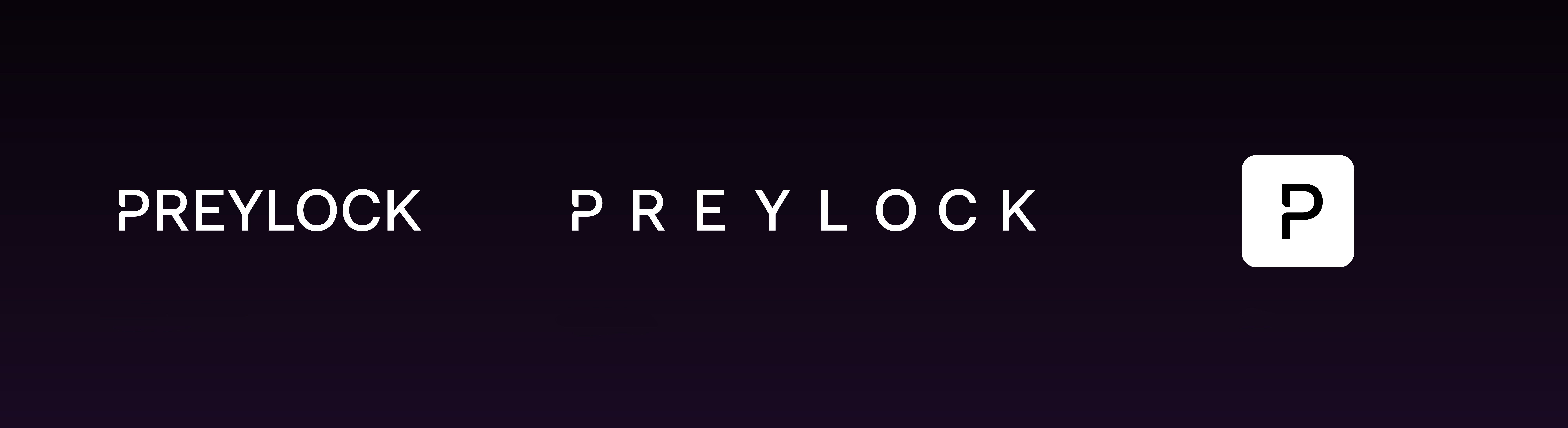

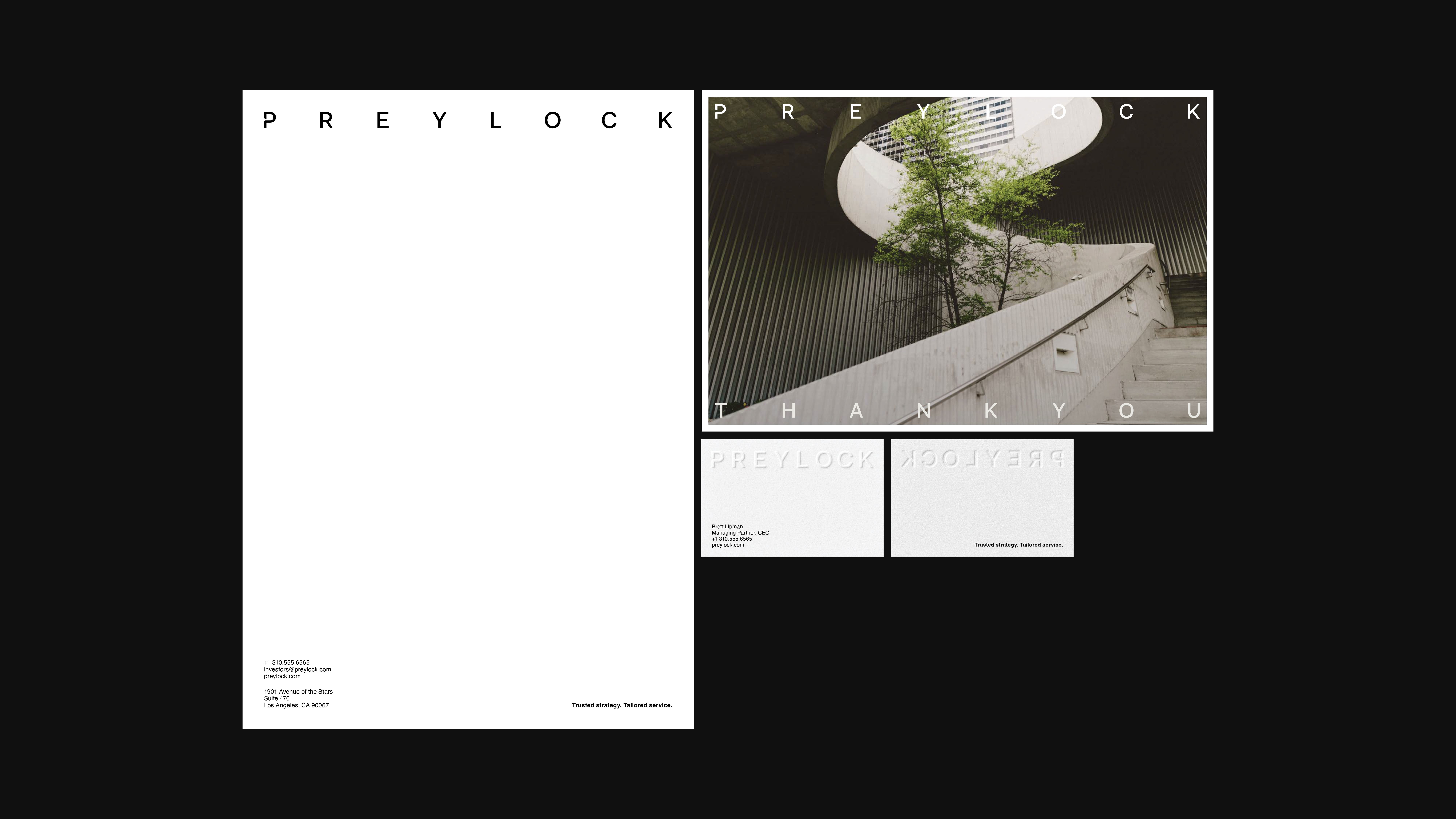
LOGO DESIGN
The Preylock logo embodies the brand’s sophisticated, forward-thinking identity. Its dynamic design is versatile, with the ability to expand and adapt across platforms, while maintaining its distinctive presence.
COLOR PALETTE
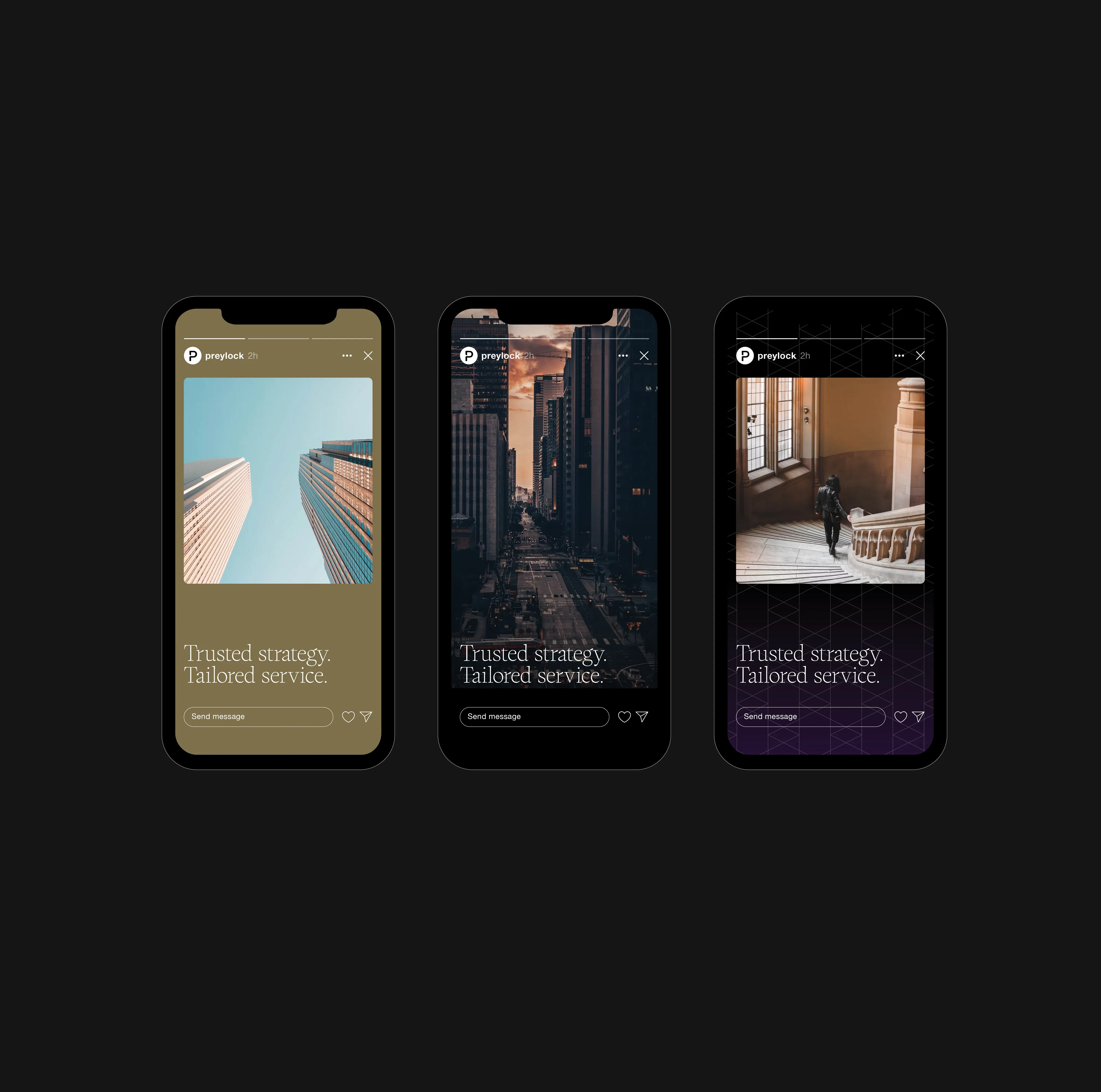
The color palette exudes confidence and expertise, featuring a rich primary base highlighted by vibrant, contemporary accents from the secondary palette.
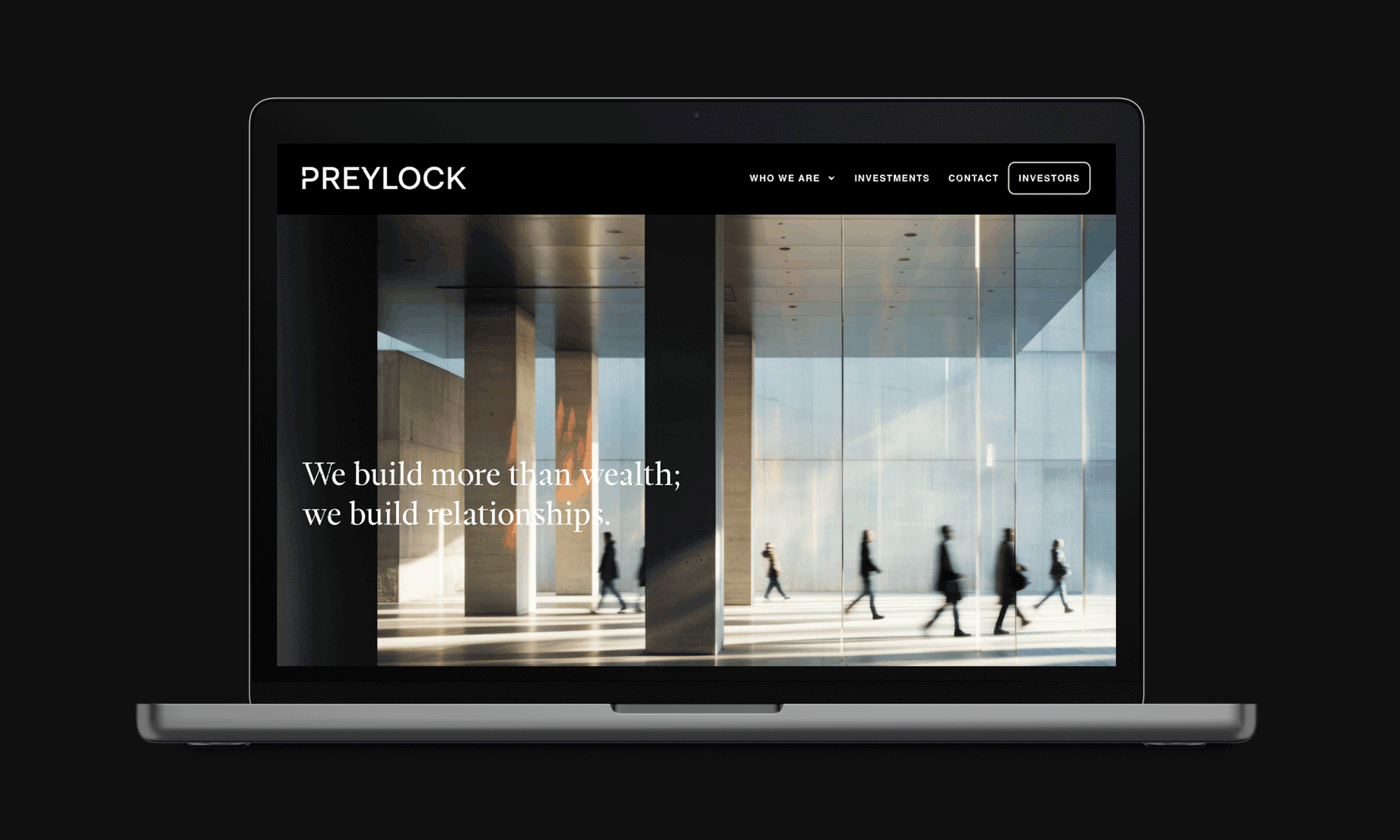
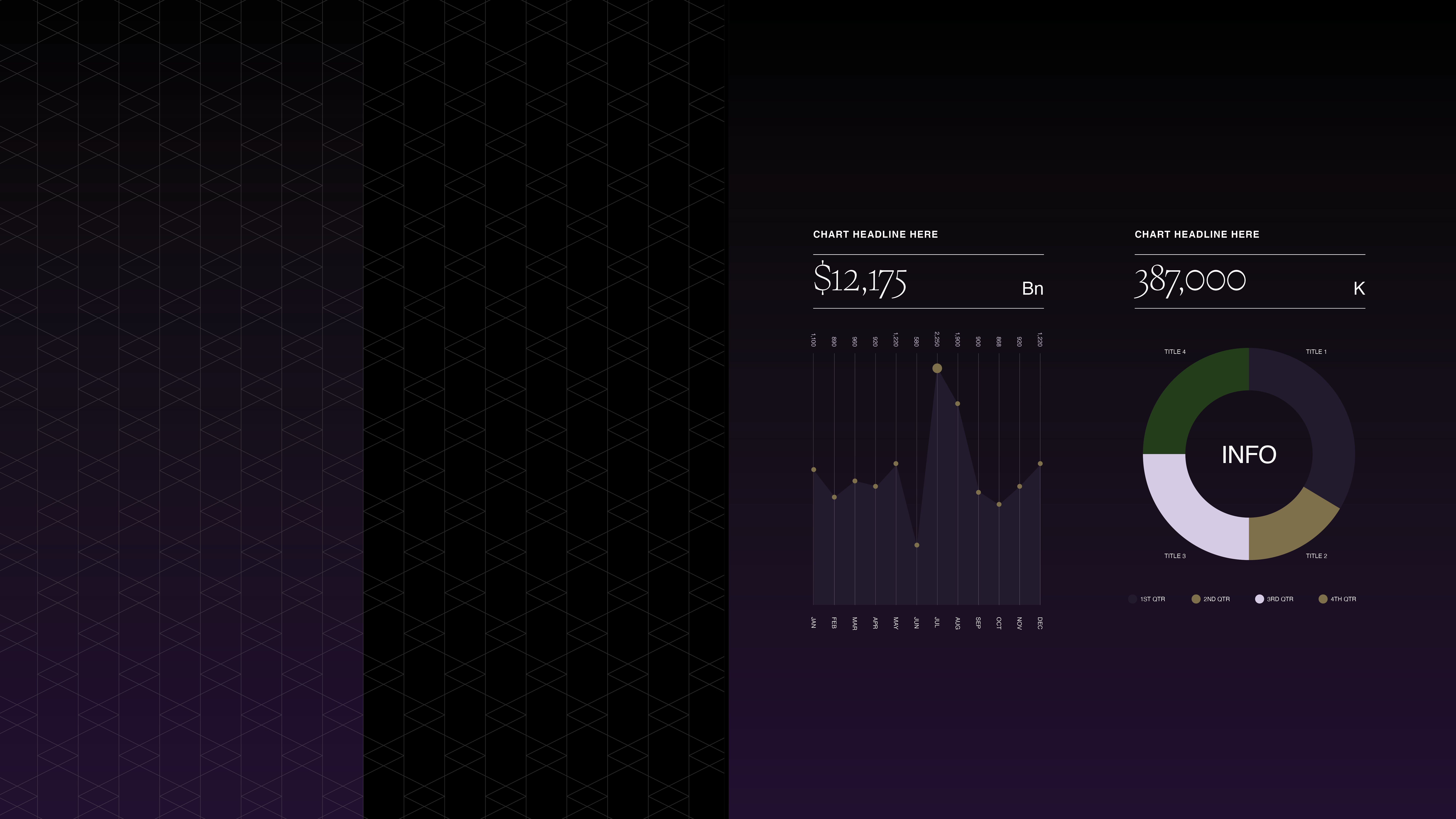
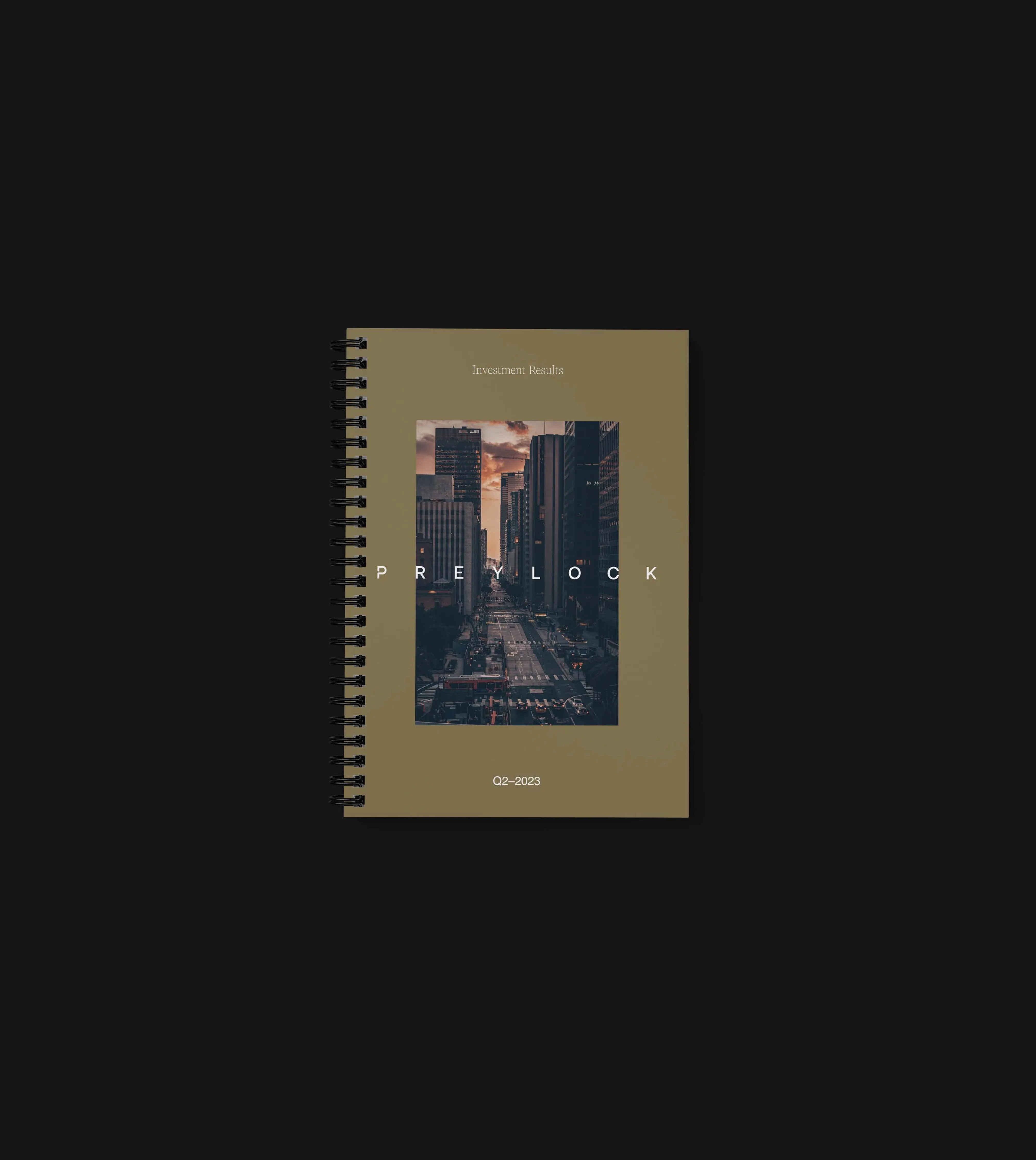
WEB DESIGNThe website fully embodies the brand’s essence, presenting a clean, refined, and sophisticated aesthetic that reflects Preylock’s high level of expertise. It balances a modern, approachable feel with meticulous attention to detail.
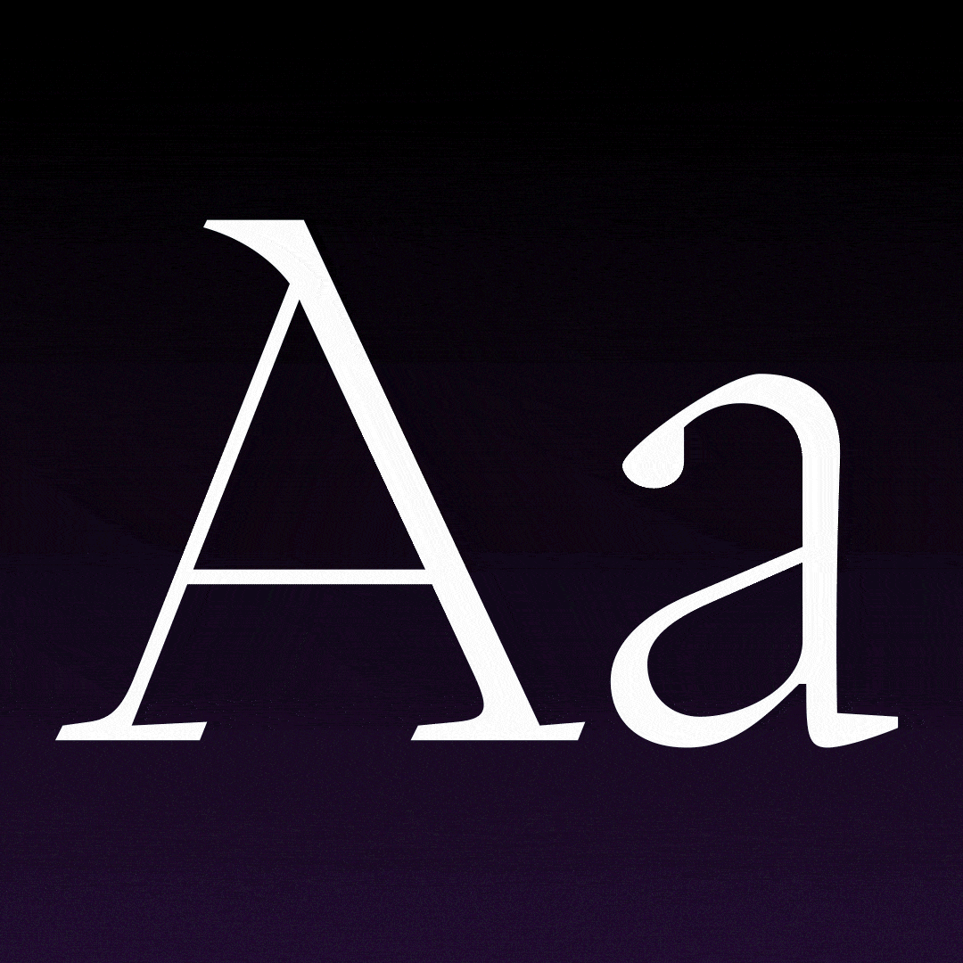
TYPOGRAPHY
Preylock’s typography strikes a balance between uniqueness and modernity. The serif typeface conveys trust and character, while the sans serif embodies stability and a sleek, contemporary feel.